Title font research
Within the title sequence of Halloween 2, the font of the titles is bold and is in capitals which has sharp corners of the letters which can connote blades which symbolises a slow and painful death. The colour of the titles is orange which connotes Halloween as Halloween is associated with dark and orange due to pumpkins being orange symbolising the season. This enables the audience to identify straight away that this is a horror film through these codes and conventions being expressed.

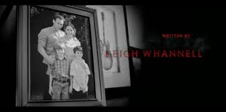

Within the title sequence of Insidious, the font of the titles is thin and in capitals which may have been done so it does not draw all the audience's attention away from the background of rooms within the house as they want to set a eerie and paranormal tone of the film which is if the titles were big and bold it may draw the audience's attention away from the background but at the same time by the titles being thin and small, it can be seen as being subtle but is visible, like a metaphor for ghosts or any paranormal presence lurking in the background as you know/feel that they are there but cannot see them. The colour of the titles is red which connotes blood, evil and danger which enable the audience to identify that it is a horror film.
Within the title sequence of A nightmare on Elm street, the font of the titles is thin and in capitals which by it being in capitals, the letters has sharp corners, it connotes blades which symbolises in a horror slasher a slow painful death which reinforces the codes and conventions of horror slashers. The colour of the titles is white which can symbolise in horror, ghosts or even death which death is code and convention is horror.The title name is big, bold and is the colour red which connotes blood, evil, and danger which is the codes and conventions of a horror slasher.
Overall, for my font and colour for my titles within my film will be the ideas taken from Halloween 2 and Insidious which the title font will be similar to the Halloween 2 titles but not as bold, as the font looks sharp, which connotes blades which symbolises a slow painful death as it will be perfect for my film as my film is a horror slasher. For my title colour it will be red,as red can symbolise evil, blood and danger which the codes and conventions of my film. By having these amalgamations of these features for my titles, it should reinforce the codes and conventions of a horror slasher to the audience as they will be able to identify immediately what genre of film they are watching and also it sets an effective tone for the film which should engage the audience from the start of the film.

No comments:
Post a Comment